Tommy’s Pizza began during the fourth semester of my undergraduate program as my first Independent Study and my first-ever full branding campaign. Having total creative control was exciting, but when the Spring 2023 semester ended, I felt the project didn’t reflect my full potential as a designer.
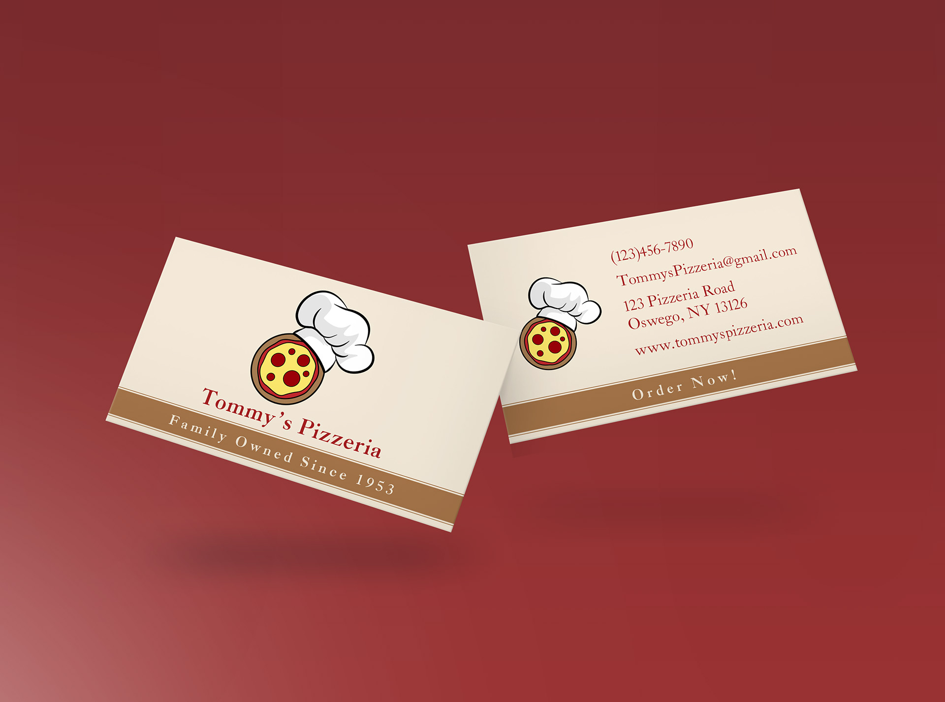
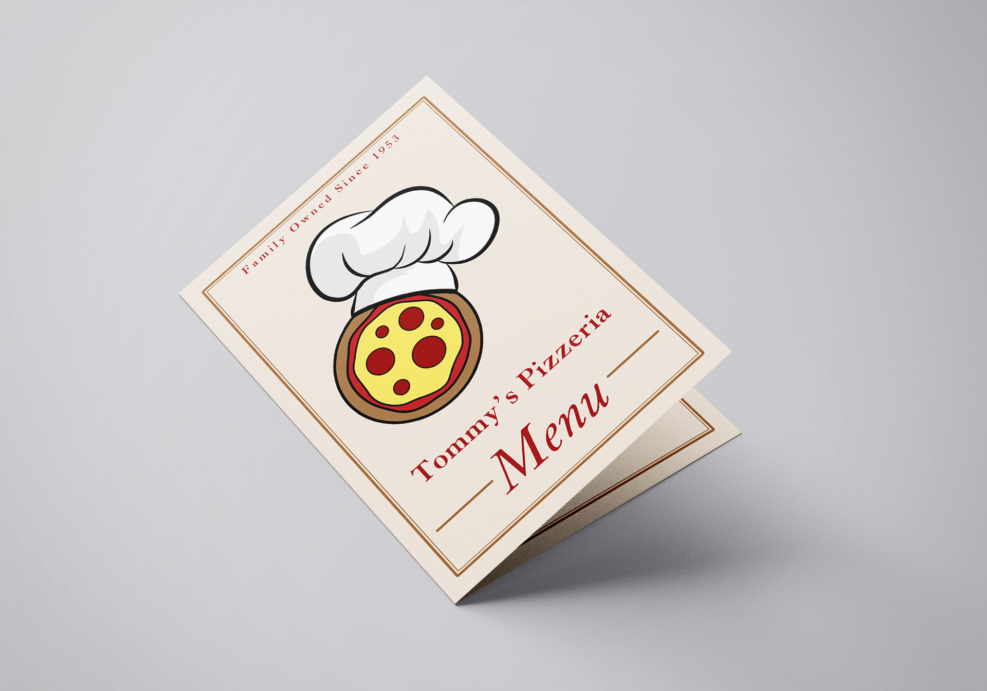
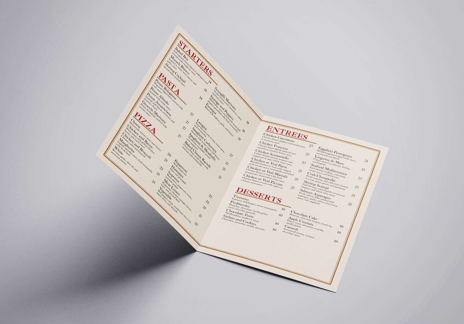
I had developed a logo, business card, and menu, but the visual balance wasn’t quite right. The logo mark felt playful and fun, while the typography came across as too serious and professional. The mismatch left the brand identity feeling unbalanced and confused.
When I submitted the project at the end of my Independent Study, I knew I wasn’t finished. My goal became clear: redesign the entire brand identity before graduation. This is where the brand was left before the redesign…
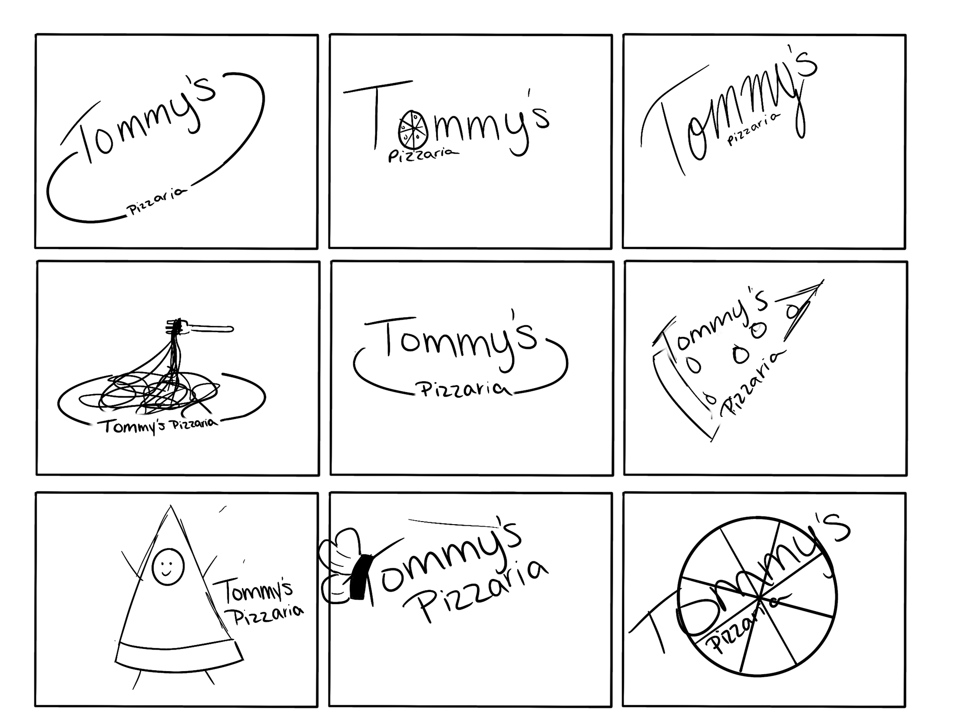
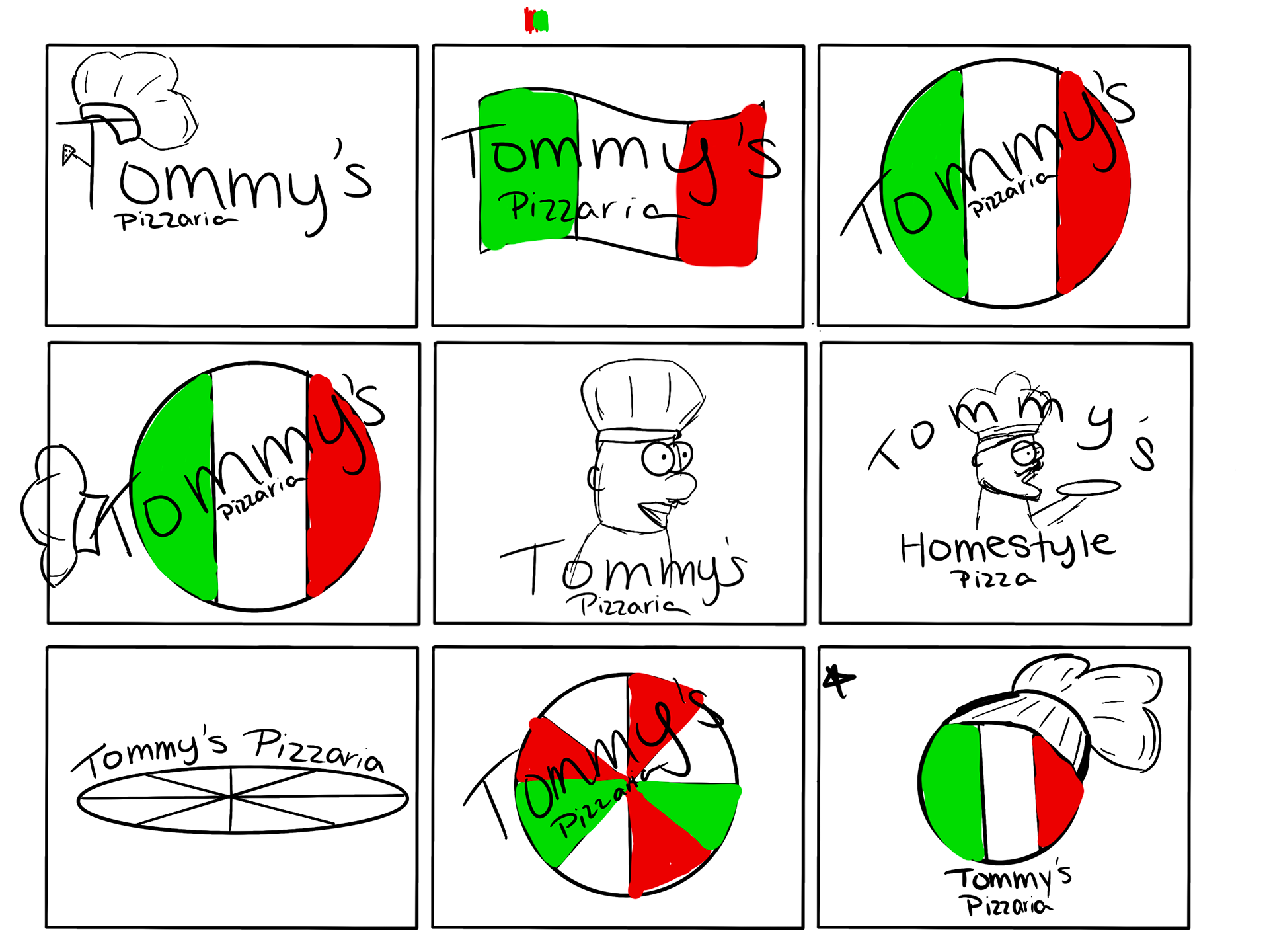
Original Design Sketches
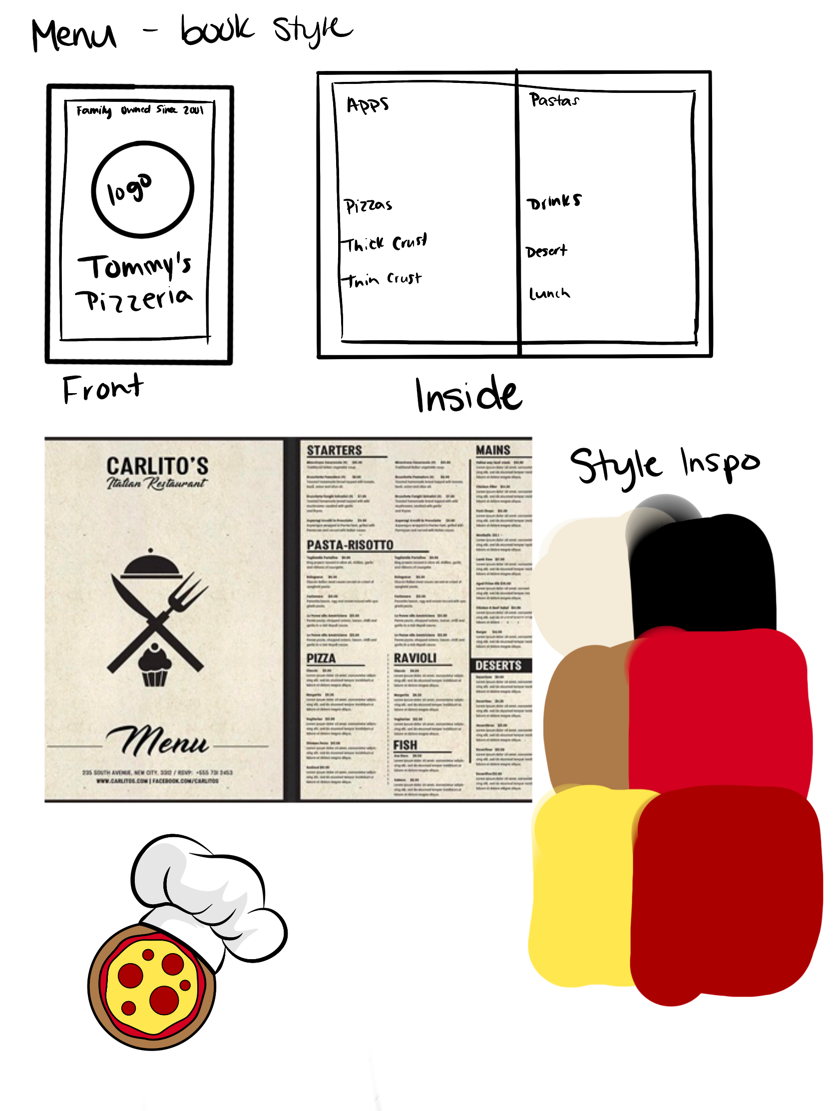
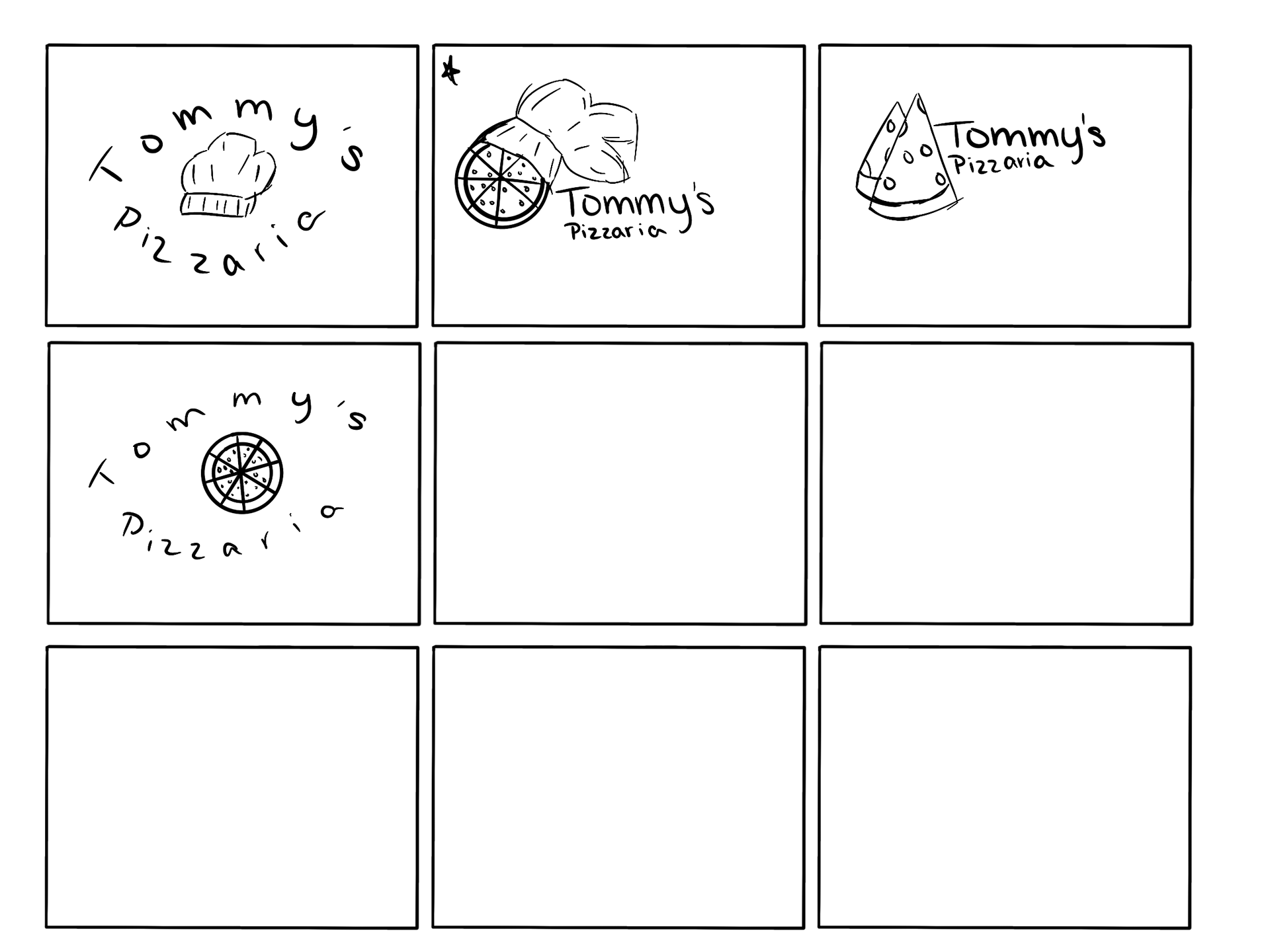
Original Designs
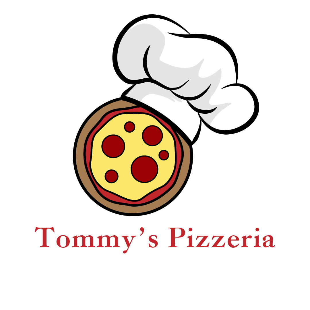
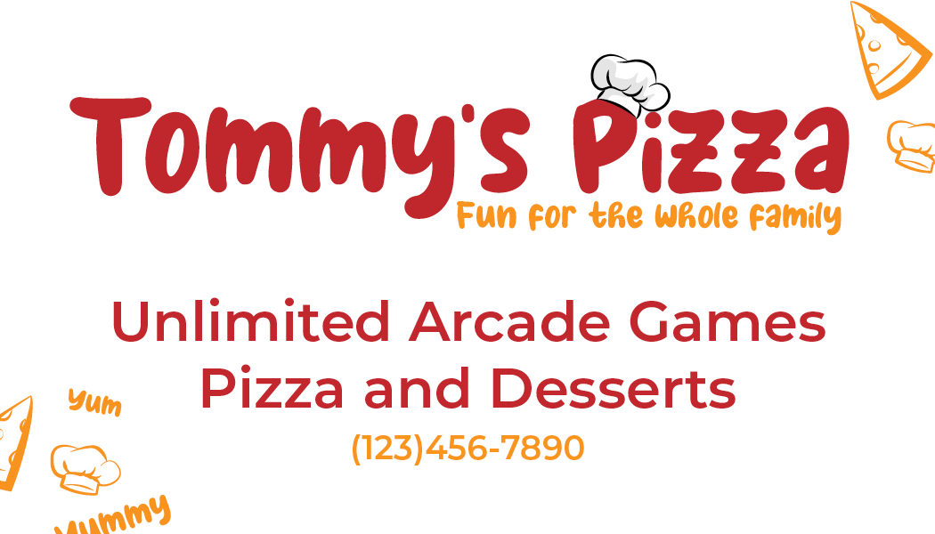
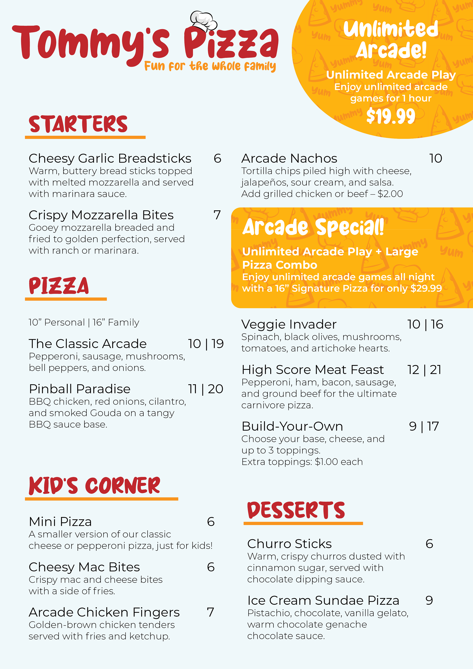
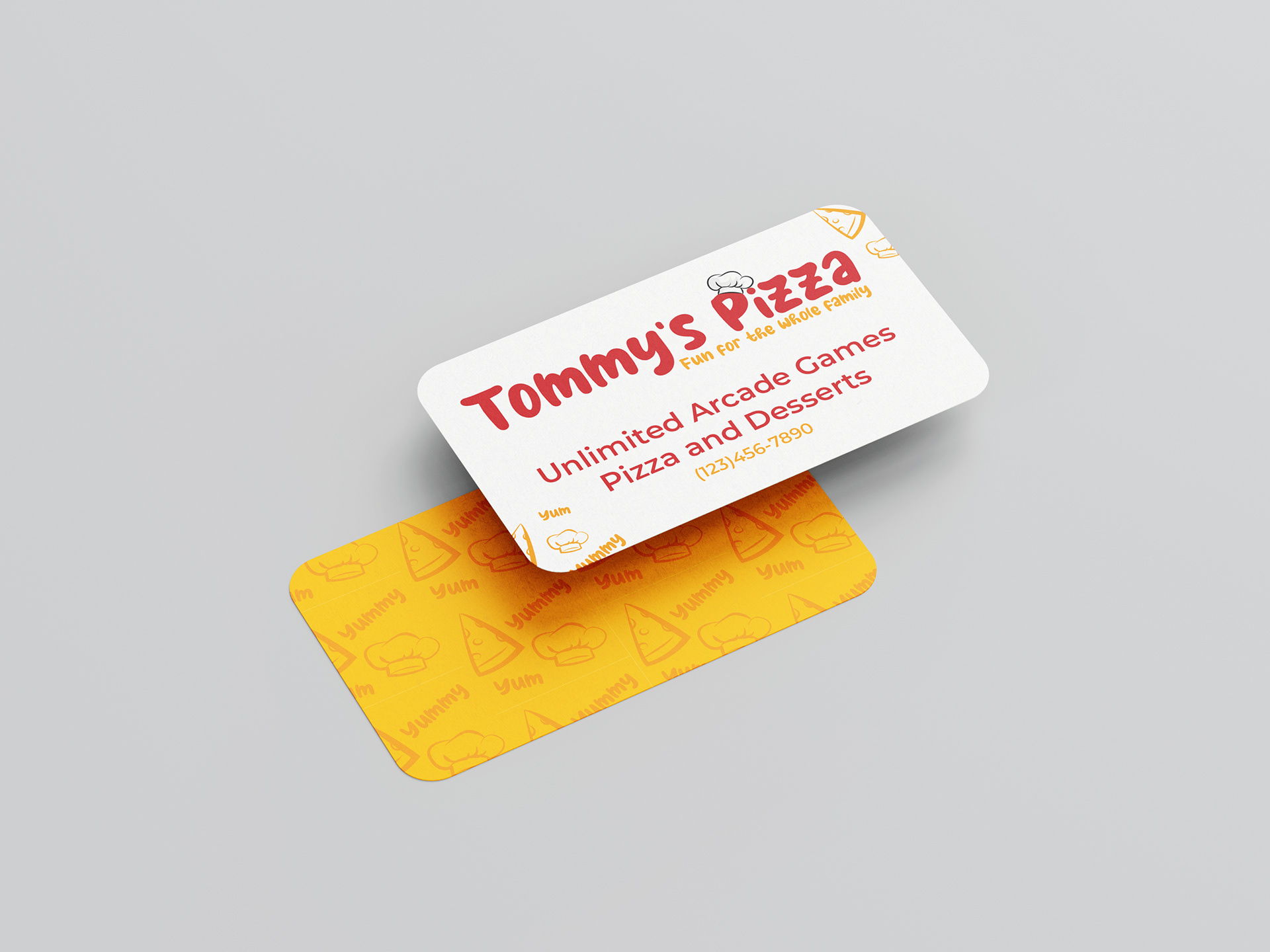
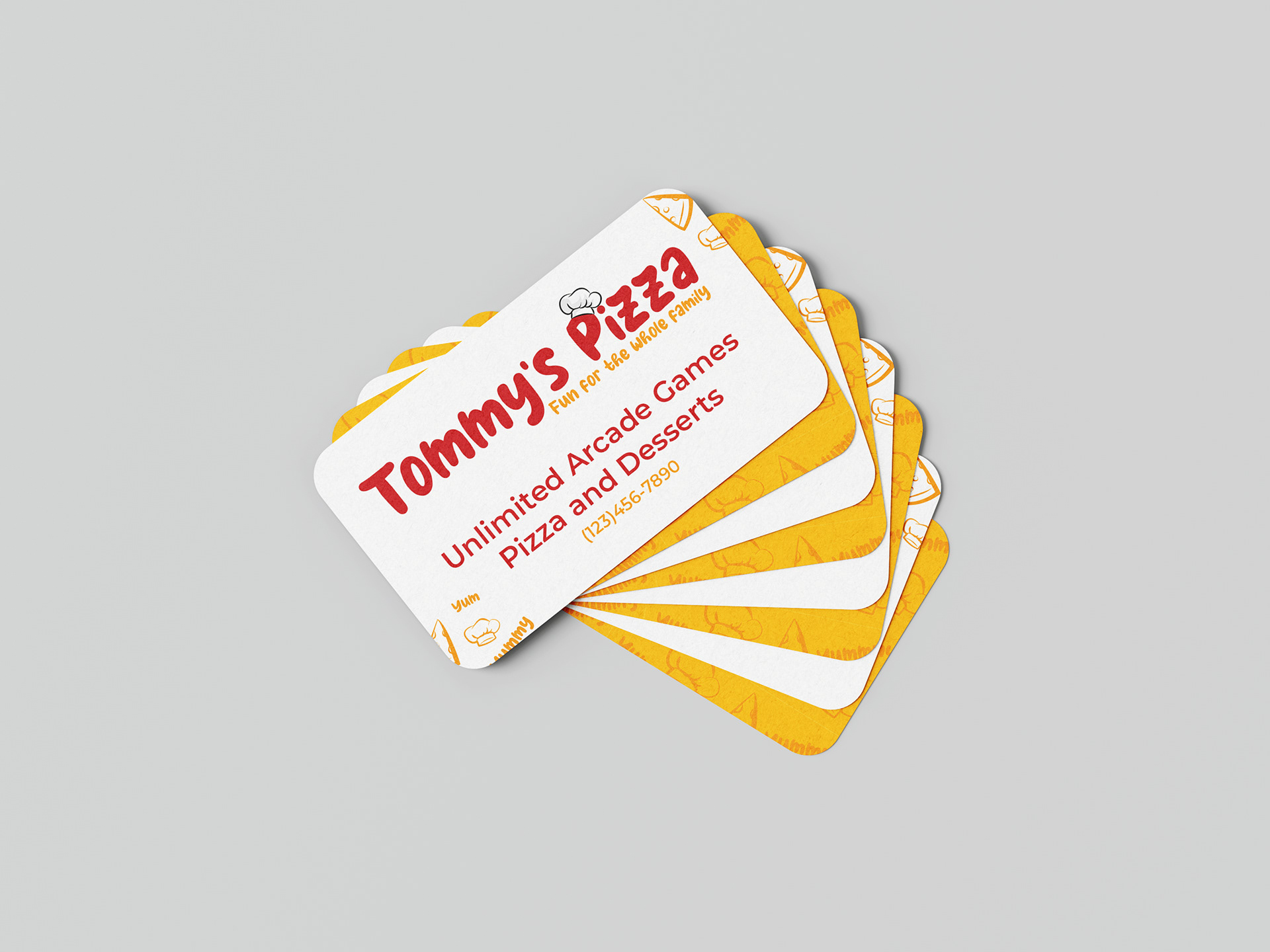
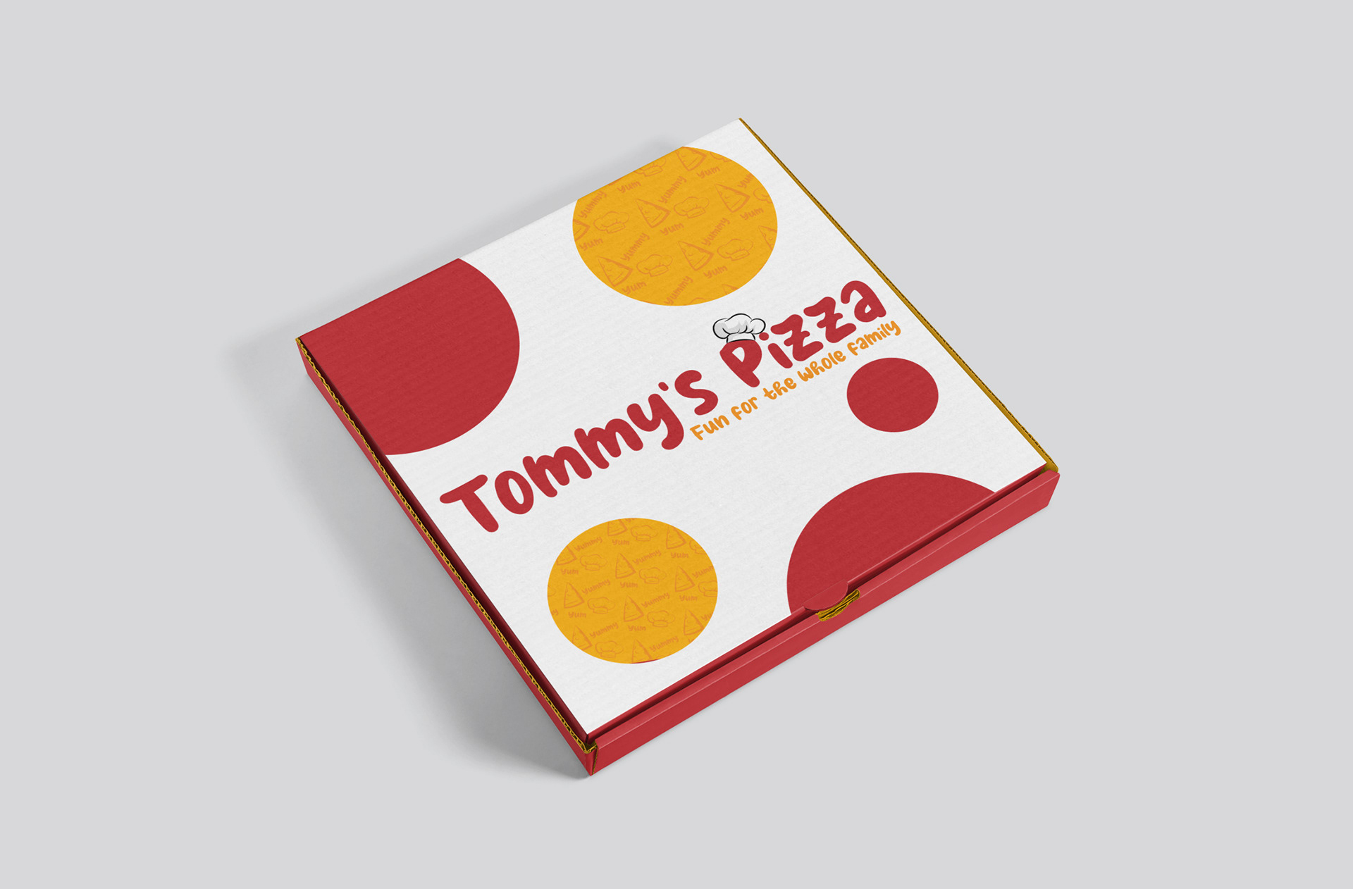
By the time I got around to redesigning Tommy's Pizza, it was my last semester of college in October 2024, a whole year and a half had passed since I originally worked on the brand. I knew I wanted the typography and style to match the fun and playfulness of the pizza logo. I also felt the pizza in the logo was too literal so that is where I began my focus.
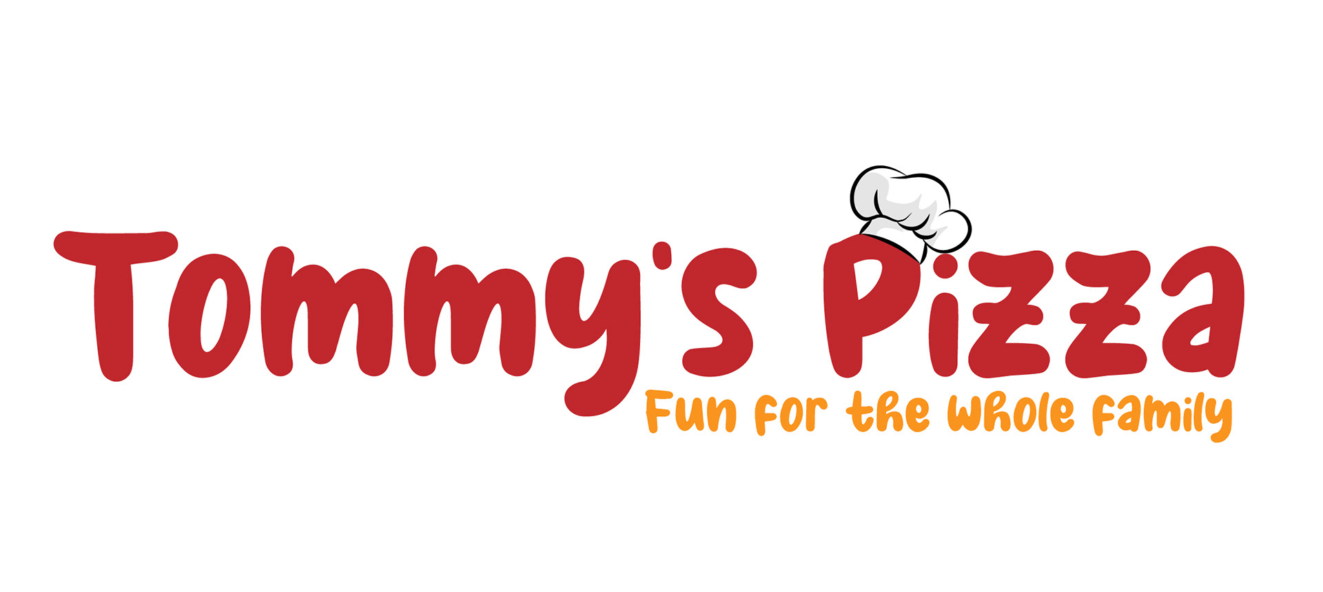
I chose to remove the pizza from the logo entirely and create a wordmark instead, keeping the chef’s hat as a nod to the original design without being too literal. For the new typeface, I wanted something fun yet functional — ultimately selecting Milky Coffee for its readability and playful personality. To further capture the restaurant’s welcoming spirit, I added the slogan “Fun for the Whole Family”, reinforcing the idea that Tommy’s Pizza is a place for all ages to enjoy.
This redesign quickly became one of my favorite brand campaigns. I love the playful combination of colors, fonts, and graphics - simple elements that work together seamlessly to create a strong brand identity. Since my design work typically leans more toward photography than illustration, this project pushed me outside my comfort zone. Exploring illustration, even lightly, was a challenge, but one that paid off in a way that truly elevated the final design.