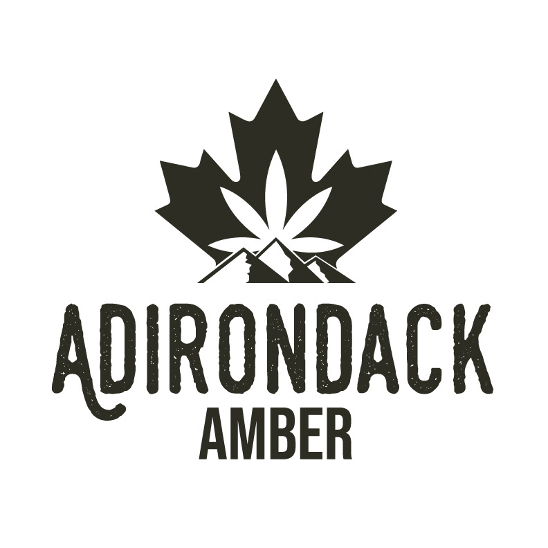
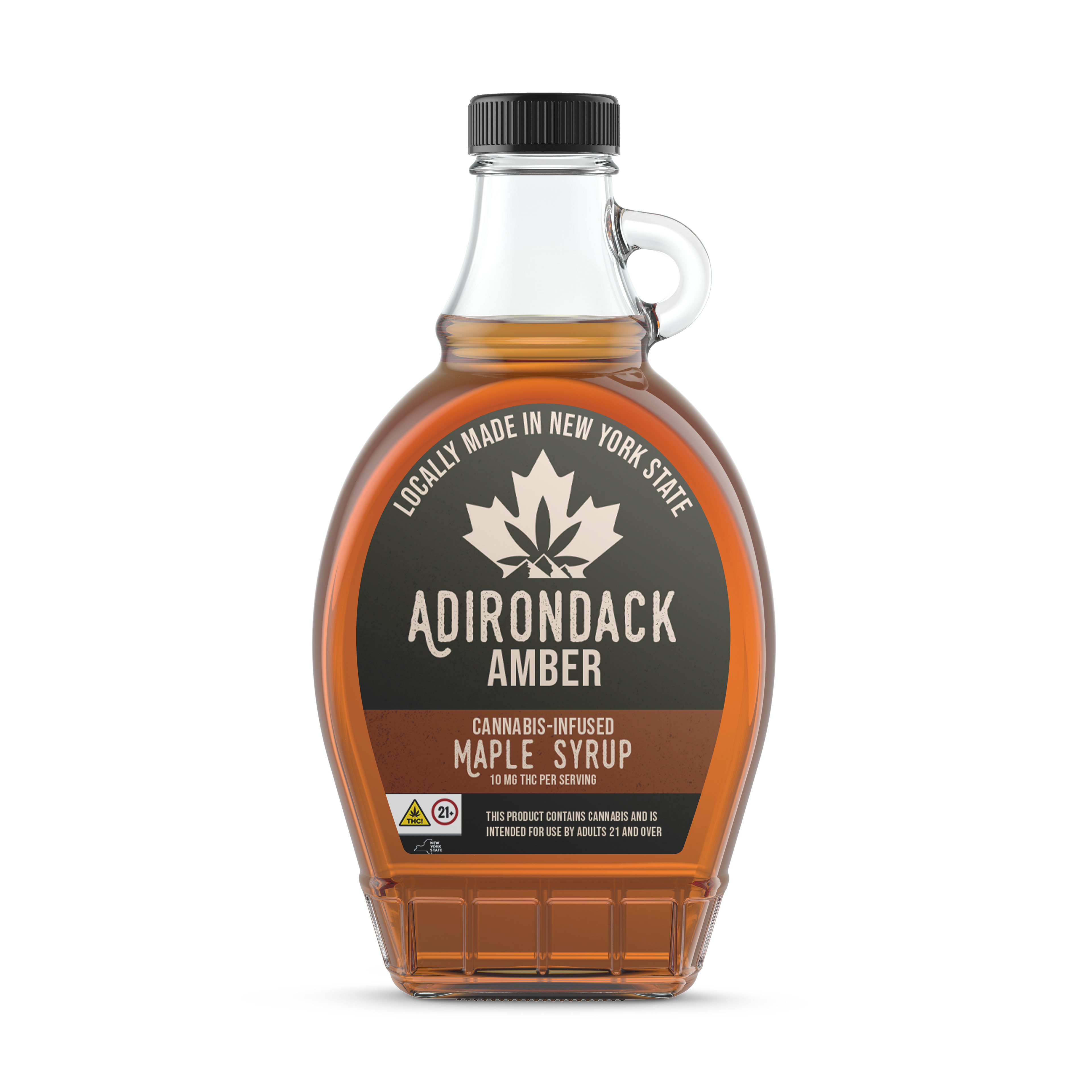
For this client project in my Branding and Packaging class, I was tasked with creating a logo and packaging concept for a unique cannabis-infused maple syrup made locally in Upstate New York. The goal was to develop a brand identity that clearly highlighted the product’s regional roots while communicating its cannabis infusion in a tasteful and approachable way.
To capture the essence of Upstate New York, I explored natural, rustic design elements inspired by the region’s forests and maple syrup heritage. The logo combined iconic imagery, such as maple and cannabis leaves, with earthy colors to balance both the artisanal and herbal qualities of the product. Typography was chosen to feel approachable yet refined, appealing to both local customers and cannabis enthusiasts.
The packaging concept reinforced the local, handcrafted feel with sustainable materials. I aimed to create a design that stood out on shelves without being overly bold or cliché. Throughout the project, I focused on balancing the dual nature of the product, sweet, natural maple syrup and the trendy cannabis market, to create a cohesive and memorable brand identity.